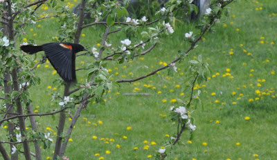
Today I welcome Shanyn Silinski to Artsy Fartsy Friday. Shanyn recently posted some lovely photos on Facebook - not the first time. Shanyn has a few things to say about taking good photos even without a great camera, and more. Comments welcome! ~ Sheila
Don’t Delete That Photo!
by Shanyn Silinski
Two rules to remember about that ‘bad’
photo you took:
1)
Don’t delete it off the
camera. That little screen for previews
won’t let you see if you actually caught something special.
2)
Look carefully at the whole
photo, not just what you wanted to take the photo of, and see if there is
anything to salvage.
I have learned over the years, using film
and digital media, that you can find a lot more than you imagined if you look
at the whole photo.
Another point if you are thinking of
deleting a photo are cropping choices and even digital edits for color, hue,
saturation and sharpness. What your eye
sees isn’t always what you capture but with good cropping and editing habits
you can make a nice image all the same.
If you want free editing with great options and control try picassa from
Google.
Do not despair of your
camera if it is not the newest or the best.
It can be used to take great photos, if you as the photographer, can
learn how to get the most out of your camera.
It wasn’t until this year that I got a DSL frame for my lenses. I always had a smaller, almost pocket sized
camera, and I took it everywhere and got really good photos. It just took taking more photos and working
harder to get them. Almost everyone,
except proficient amateurs and professionals, undershoot their equipment. Even then lots of times we get a bit lazy and
don’t fully use our gear as it could be.
Go back to the basics –frame your
shots. Make sure you know not only what
you are shooting but what is around you.
Think about light. Think about shadows.
And take LOTS of photos! You can
delete before you print a single one.
Back in the day we did our deleting and cropping in the darkroom, now we
do it on a laptop or phone.
If you get a chance to frame your shot,
look for things that add drama and visual interest. If you are walking around, take photos from
lots of different angles, get on the ground if you can or go over top, find an
extreme angle and see how it feels.
Remember what is behind your subjects, and
think about light as well. Is the shot
nice but the background terrible? Try a
different angle.
Once you are back on the computer, check
for all the elements in your photo before you crop. There may be a photo that could be cropped
into two shots. Looking at the sides and
background components can add a lot of fun to a shot.
 |
| He is a nice little bull, and looking right at you, but this wide a shot has the distraction of two other cows. |
 |
| This is a nice enough shot, good composition and
color. A couple of visual triangles but quite flat. Let’s try another angle. |
 |
|
Same group of flowers, just
changed my angle a bit, and instead of trying to capture all the flowers inf
focus I chose one.
|
 |
In this shot, they are not looking at me, but I still know they are playing. The visual triangle moves from their heads to the toys to their hands.
|
 |
| This siding is terrible. It is a neutral color but the horizontal lines are very distracting. I took a few steps to my right and knelt down to get this final shot. |
 |
| You can see faces, you can see their hands mirroring each other in play and you can see the sand and toys. It tells a complete story with visual interest and very few distractions. |
 |
| The new pine cones on the spruce tree were very nice, but in this shot there are a lot of them and it seems busy. |
 |
| Portrait of Shanyn by Earl Silinski. |
Shanyn is a poet, author, photographer who lives on her small ranch with her sweet husband and son in south eastern Manitoba, Canada. She started taking photos when she was old enough to hold a camera and load her film. She blogs in a number of places but you’ll find her photos mostly at Shanyn's blog and with her poetry at Sunflower Poetry Her facebook page Photos by Shanyn is all photos, all the time! Her favorite things are her Nikon DSL camera, taking macro shots and finding new ways to capture her son’s laughter and the beauty of nature.
All
images copyright Shanyn Silinski, Photos by Shanyn. Used with permission.


Thanks for having me Sheila, and I'm glad you exerted your editorial authority to include the blackbird photo!
ReplyDelete